Design Details: Bay Area Project Reveal Part II
- Leclair Decor
- Jun 1, 2022
- 2 min read
Back to the Bay! We’re bringing you part II of our Bay Area Project reveal, this time exploring the guest suite and additional bathrooms of the home. Our collective vision for this full-service decorating project carries through these spaces, as seen in the cool-toned, coastal California style we’ve woven together with carefully curated furniture, fixtures, and decor.
We played with softer, cooler palettes in these rooms, finding new ways to add our signature Warm Modern aesthetic with a focus on textures, fixtures, and more fun wallpaper!
The Spaces
The Guest Bedroom
Our Bay Area clients are gracious hosts who often invite family to stay with them. Must-haves for the finished space included an inviting and comfortable layout, a look that distinguishes the space from the rest of the home—allowing guests to consider the suite their own private retreat, and office space for our clients who occasionally work from home.
We had fantastic bones to work with, including large sliding doors that open onto the closed-in front yard, providing a dedicated outdoor space for guests. We explored a new take on our high contrast palette in this guest suite, using a mix of cool tones like charcoal, grey, and white coupled with natural materials in the pendant, bench, chair, and rug to add warmth. The dramatic charcoal curtains achieve our signature high contrast in a softer, more subtle way.
The Guest Ensuite
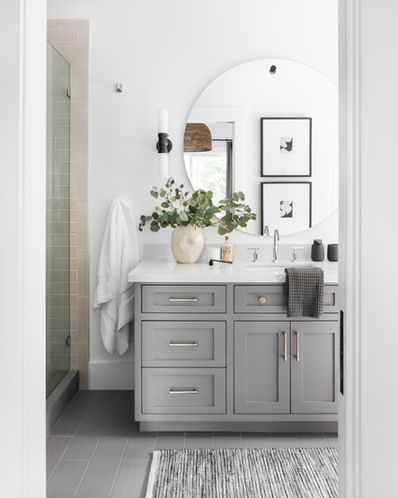
The adjoining guest ensuite required a hint of LD magic to feel complete. We put a Warm Modern spin on this cooler space with soft brass cabinet pulls, a minimal mirror flanked by two white glass and bronze sconces, and thoughtfully selected decor. On the opposite wall, we stacked abstract black and white artwork for a pop of high contrast that grounds the eye via the mirror as well.
Designer Insight: We typically hang artwork above the toilet, but we realized there was already plenty of visual interest on the vanity wall. To keep from overwhelming the eye, we hung the artwork on the opposite wall to maintain a fresh, refined look. Editing is key!
The Powder Room
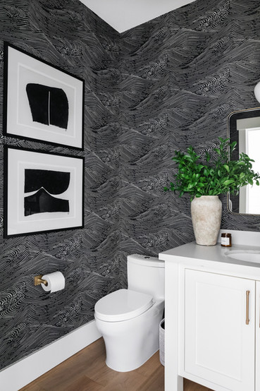
A small powder room is a great place to make an impact! We used moody, Japanese wave-inspired wallpaper as the backdrop for a memorable space. The movement of the wallpaper contrasts with the bright, clean lines of the millwork, while the hardwood flooring and brass hardware add warmth to the black and white palette.
The Kids' Bathroom
Our goal was to create a functional yet serene shared bathroom space for the children of the house. The vanity and finishes were already in place—we upgraded the lighting and mirrors and added finishing touches to infuse the bathroom with personality.
Designer Tip: Adding dimmable wall sconces is a small swap that makes a huge difference in the feel and ambience of the space. Check out our lighting selection guide for more quick tips!


Comments