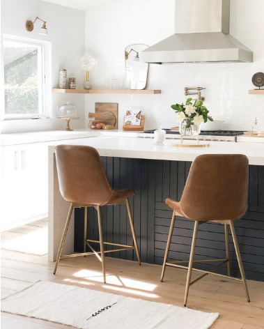
Our plan in a nutshell: If we put together and publish a blog post about our kitchen renovation plans, then actually completing the project this year will be manifested in the universe, right? Well — that’s what we’re hoping for in 2020! Most designers know that your own home can take a back seat to client projects and running a business. We’ve been slowly getting a vision together and ticking smaller projects off the list in our own space since moving in a few years ago, but we’re starting to really feel the itch to make some major changes that will make our house truly feel like it’s ours. Today, we’re sharing some of our inspiration and dreams for our kitchen renovation in the hope you all may help to keep us accountable! Fingers crossed that this project makes its way into our schedule this year.
So Here’s The Thing…
We were initially leaning toward a black statement kitchen but now (like always) we are debating between creating something super design-oriented OR a simple and timeless look. So who knows, we may end up with a classic all-white kitchen in the end. When it comes to our own home, we love that we have complete creative control. We enjoy designing outside the box, inventing and creating new ideas — but we still want to create something that is widely appealable (and that another family might want to buy and enjoy some day!). You can see our dilemma and why we’ve been a little stuck in design limbo.
The Layout
Here is a quick screen grab of the preliminary plan for our kitchen renovation. We are pretty happy with the overall layout but are toying with the idea of adding some built-in shelving to the kitchen island. We don’t have anything 100% locked down yet so stay tuned for future blog posts on the evolving design and some before shots.

Mood Board #1
Classic Leclair Decor Style: Warm Modern

This design is in line with our signature Leclair Decor aesthetic, which we call Warm Modern. There are plenty of graphic and linear details, a bit of a coastal influence, and of course our never-ending love for a black and white high contrast statement. This design direction is something we almost certainly never tire of, but it feels like the safer option of the two. Safe doesn’t mean bad, but we love to challenge ourselves (and our clients) to think outside the box and our home is the perfect place to take risks. If we go with this option, we’ll definitely include some unique elements to make it more us, like the slat detail on the island.
Inspiration Source | Photo 1: Design by M House Development Photo 2: Dusty Lu Productions
Mood Board #2
A Little Out There: Wooden Cabinetry & Custom Cross Hatch Back Splash

This design is edgier, bolder, and leans a little moody — which we LOVE! The wooden cabinetry might have made us cringe a few years ago but as we scroll through our inspiration photos, we are LIVING for this look. There are so many layers of texture in this design, which make it incredibly inviting, cozy, intriguing, and almost romantic in a way. We can totally picture making coffee in this kitchen on a rainy morning and just feeling totally wrapped up in earthy tones and textures.
Inspiration source | Photo 1: Design by Louise Liljencrantz Photo 2 & 3: Design by Luke Fry Architecture & Interior Design Photo 4: Design by Nordiska Kok
So here we are, still definitely caught in design limbo. We are stuck because we truly LOVE both options. One is timeless and fresh, the other is impactful and boundary-pushing. We’re curious: which is your favourite option and why? What would you do in your house? Let us know in the Comment Section below!


Comments